ART AND FURNITURE EXPERT DEBORAH MOSS TALKS STORE DESIGN

We’ve written about it constantly over the past year and a half – COVID-19 and its endless effects on the world and retail. And, as you know, when lockdowns forced consumers to go online for all of their needs, brick-and-mortar stores were obligated to adapt quickly to a new way of doing business online or close altogether. Those retailers that poured dollars into building their digital assets in order to be able to compete these past 15 months are now faced with a new challenge – bringing their customers back in stores.
While most consumers are just happy to be back out in the world and love the ability to shop in stores again, there are some new expectations and digital conveniences that they don’t want to give up. Will retailers have to redefine the concept of luxury shopping to entice their clients to visit their stores? Can this be done with a store refresh with striking furniture and personalized installations?
In order to find out, we recently caught up with international custom art and furniture expert Deborah Moss for a no-nonsense analysis on which questions retailers should address when thinking of improving the aesthetics of their brick-and-mortar stores.
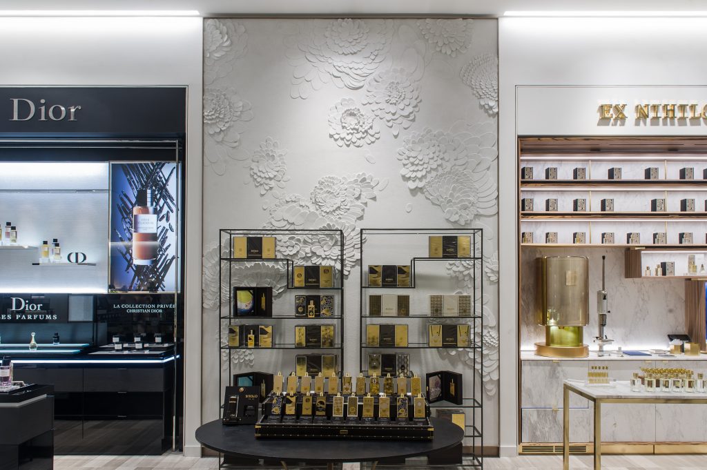
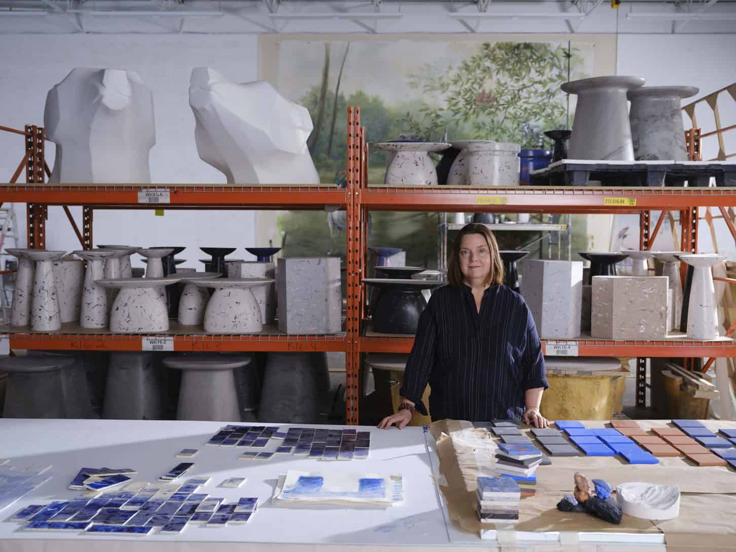
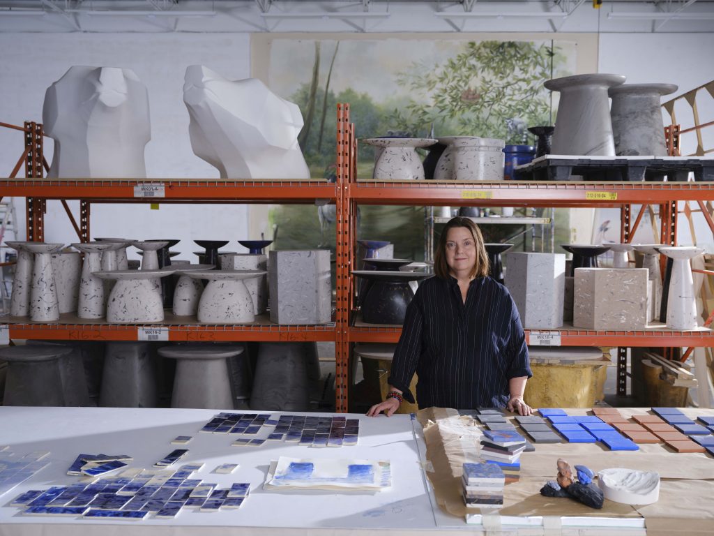
Moss, the co-founder and creative director of Moss and Lam – a custom art studio based in Toronto, Canada – has been commissioned by some of the world’s leading interior designers and architects to create custom artwork, wall surfaces, and three-dimensional installations that are visually and structurally integrated with their environments. In fact, Moss and Lam has created large-scale commissions for many international luxury brands in the hospitality and retail industries, as well as public art commissions throughout Canada. Past projects include Saks Fifth Avenue in New York City; Lane Crawford department stores in Shanghai and Hong Kong, Printemps department store in Paris; and Clement Restaurant in the Peninsula Hotel in New York City.
Here, we catch up with Moss on what retailers should address when thinking of improving the aesthetics of their brick-and-mortar stores and if customers really do spend more time in a well-designed store.
Q: Do customers really spend more time in a well-designed store with thoughtful furniture and art?
A: If a customer feels welcomed and considered, yes! Customers today are beyond informed with instant access through social media to the latest news, openings, and product drops. To get people in the doors, the retail space must truly consider the need to make a deeper connection to challenge expectations and create a bond with customers. This doesn’t mean going towards entertainment or novelty. I think the days of over the top and excess are over. Eventually, people will just want to trust their brands. Custom Furniture and art are part of the picture that can represent the brand to elevate the customer’s perception. Everyone curates their lives these days in terms of the choices they make. This goes back to instant access through social media. People can follow the goings on and latest openings in the most far-flung places. They know what the latest store looks like, so how to maintain validity? Well-considered commissioning of art and furniture enables a space to set them themselves apart and add to the experience of the client. So many retail spaces today now compete with art galleries as venues to represent what is cutting edge.
Q: What should retailers address when thinking of improving the aesthetics of their brick-and-mortar stores?
A: Aesthetics must suit the brand but it is important to be open to change. The operative words for me are improvement, adjustment, and reassessment. There is so much talk of the “new normal”… how do you respond to that as a retailer let alone as an individual? I think retailers must think about being brave. Beyond the cost to implement a shop’s new design, there’s the confidence needed to be able to make a statement about what matters – create some pleasure and enjoyment through art and furniture!
Q: Are there specific “trends” when it comes to interior design of retail shops?
A: As soon as a trend becomes apparent it’s time to move on. I’ll say let’s make confidence to make a unique statement through interior design to be a trend. I think about the proliferation of pop-ups, drops, and celebrity collaborations. The spontaneity of a pop-up or Instagram post creates a buzz and excitement that seems more relevant than the massive flagships. The permanent stores are still critical but they need to relate to other experiences now available to the customer. This goes back to the confidence required so it’s not one or the other. I think elevated personal service is key to add to any memorable retail experience and should be a trend on any retailer’s radar.
Q: What are classic, easy-to-incorporate, design elements any retailer could add to their store to make the customer experience more enjoyable?
A: A charming, friendly, helpful sales associate is the best thing to support the store! You can have the best store design on the planet but that meaningful personal connection is even more important these days. Cleanliness as a design element. You can have an amazing looking store but I’ve been disappointed often enough by dusty floors and change rooms. Oh, a few hooks in a change room and a place to put your handbag….so many change rooms forget these simple considerations of the customer…
Q: What has been your most memorable store design you’ve completed, and why?
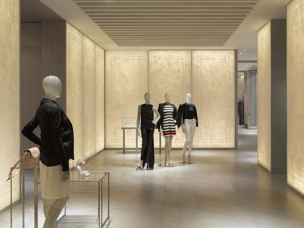
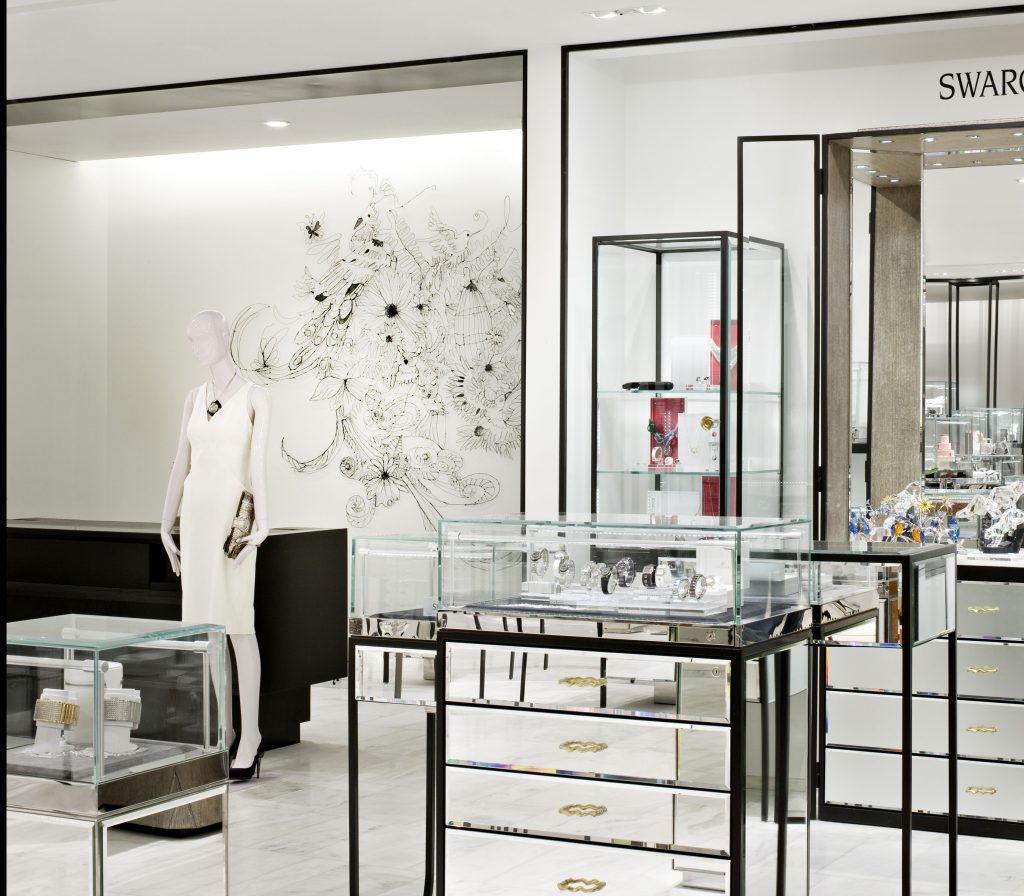
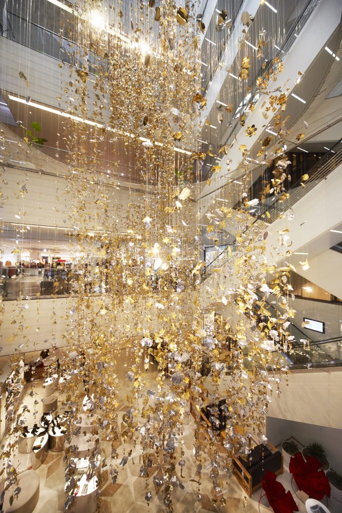
A: Moss and Lam collaborates with designers who commission us to create a mural or mobile or other art pieces for retail as well as hospitality. We are like the icing on the cake! We don’t design the space but we are that special memorable detail. I loved a wire sculpture wall installation we made for Printemps Department store. It was handmade with simple wire. It was a lush composition of animals and flowers and musical instruments – like a sculptural line drawing. I loved the intimacy and simplicity of this piece within a bustling department store. I’m very fond of an installation of backlit painted panels we created for Lane Crawford in Hong Kong with Yabu Pushelberg. It was very subtle but theatrical at the same time and created a very magical mood.
