WGSN AND COLORO ANNOUNCE COLOUR OF THE YEAR 2026

WGSN, the world’s leading consumer trend forecaster, and Coloro, the leader in color excellence, have announced Transformative Teal as the Color of the Year for 2026. The companies also unveiled five Key Colors for A/W 26/27.
Redirection is the overarching theme driving the Key Color selection for A/W 26/27. With old ideas being challenged, opportunities are on the rise, calling for urgent change. For color, polarizations are at the heart of the Key Colors, from opposites in the color wheel to how each color makes people feel—the emotions they tap into and those that will motivate consumers.
Key Colors A/W 26/27 feature a mix of grounding darks, responsive brights, and soft neutrals showcased across industries. They reflect the need for balance, excitement, and stability.
Darks remain important as consumers turn to colors with longevity, being driven by the “absence” of color. In contrast, rebellious attitudes continue to influence the brights this season, with these colors championing unity and togetherness. The search for restoration drives the need for healing tones with additional soft neutrals and pearlescent pastels helping to balance seasonal brights.
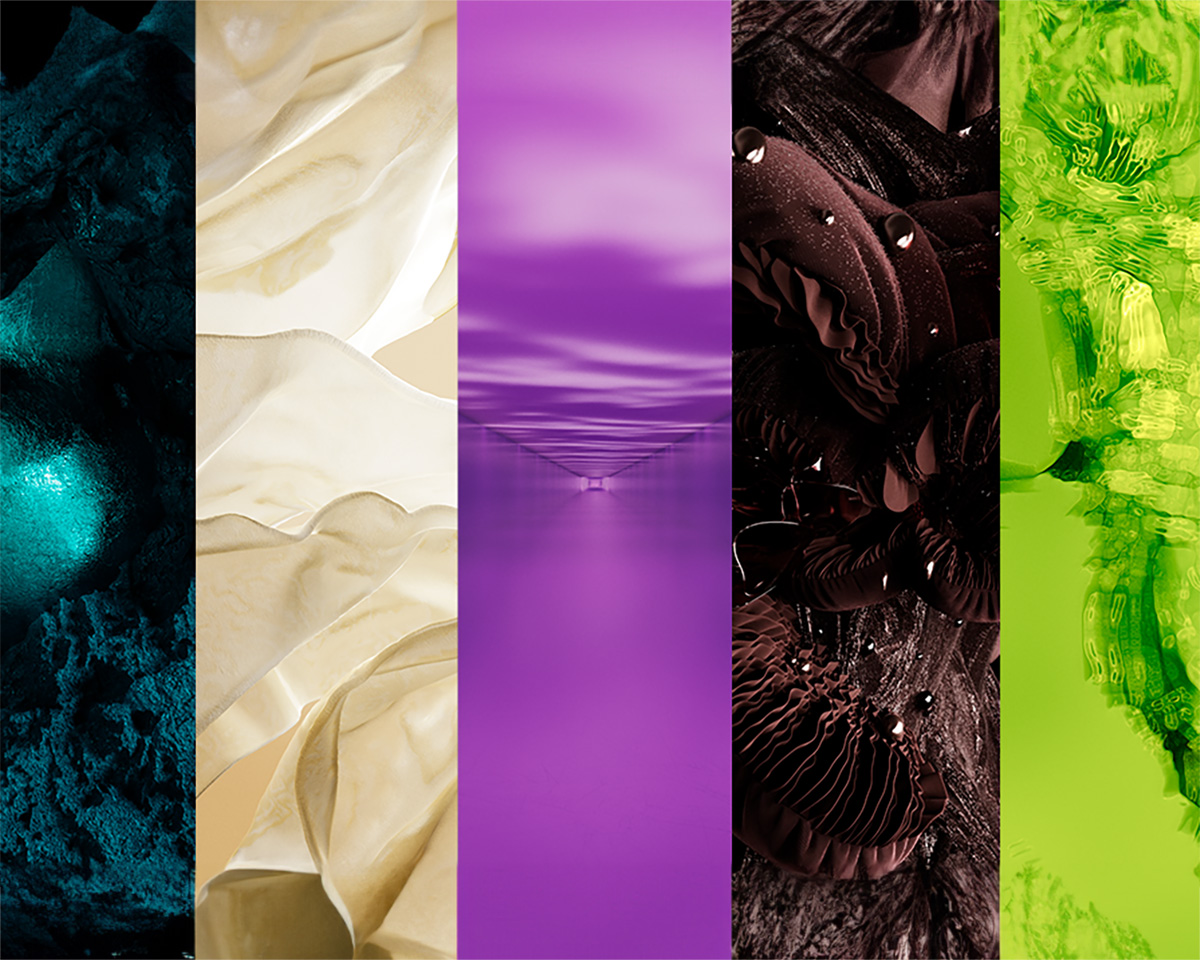
The Key Colors for A/W 26/27 are Transformative Teal, Wax Paper, Fresh Purple, Cocoa Powder, and Green Glow.
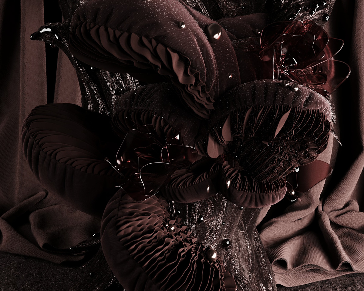
Color of the Year: 2026: Transformative Teal – 092-37-14
![]()
Sitting between blue and green, Transformative Teal is an awe-inspiring and intriguing hue that champions the importance of an Earth-first mindset. A shade that connects with resilience, for this season, we look towards the connection between digital or terrestrial and natural or post-natural to push this shade into a new world with planet positivity at its core.
With hyper-imaginative and restorative darks continuing to come to the fore, we see Transformative Teal be reimagined with transformative finishes that feel multi-sensory, dynamic and mysterious. Transformative Teal aligns with the need for recovery, regeneration and redirection, driven by the urgent need to find solutions for our planet.
Urangoo Samba (she/her), Head of Colour for WGSN, said: “Chosen as the Color of the Year for 2026 due to its versatile and multifaceted quality, Transformative Teal, is an intriguing new dark that feels both mysterious and mesmerizing. I am very excited to see this hue being used in various surface applications in many industries including Sports & Outdoor, Beauty and Tech.”
Sansan Chen, Managing Director of Coloro, the innovative color system used in the forecast, said: “Coloro Feasibility Intelligence was used to determine that Transformative Teal is a highly achievable color across all major textile substrates – both in terms of match and metamerism. It has good levels of light fastness and no major callouts in other fastnesses. Brands should feel really confident about executing this key color.”
Wax Paper – 035-88-12
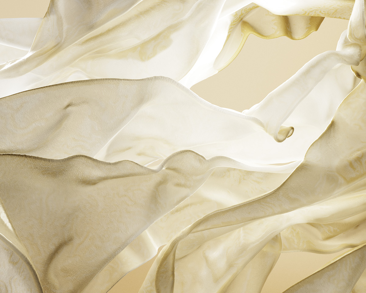
The creamy yellow off-white shade of Wax Paper is a calming, near-neutral shade with a soothing and serene character. There is a warmth to this hue that evokes feelings of glowing from within, diluted winter sun and bathing in that light.
Fresh Purple – 136-32-33
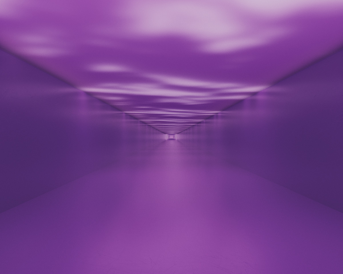
Fresh Purple is a culturally emotive color with links to royalty, love, mystery and spirituality. This shade is about flipping what we know about it on its head and looking at it from a fresh perspective. A color that can be loved or hated, we look at Fresh Purple as a journey and the coming together of red and blue, with this shade signifying togetherness and unity.
Cocoa Powder – 008-35-06
Cocoa Powder is a red-toned brown which evokes feelings of nostalgia. Inspired by a craving for the past and physical reality in the age of AI, this hue champions art, craft and handmade. There is a tenderness to this shade which brings to mind the passing of time and a search for slowness. Both rich and familiar, it heralds “the renaissance of real” as we look towards human-made techniques in a digital age. Championing a new generation of digitally savvy creatives that are looking to blur the line between AI, natural and man-made, we look towards the reinvention of ancient techniques.
Green Glow – 057-82-32
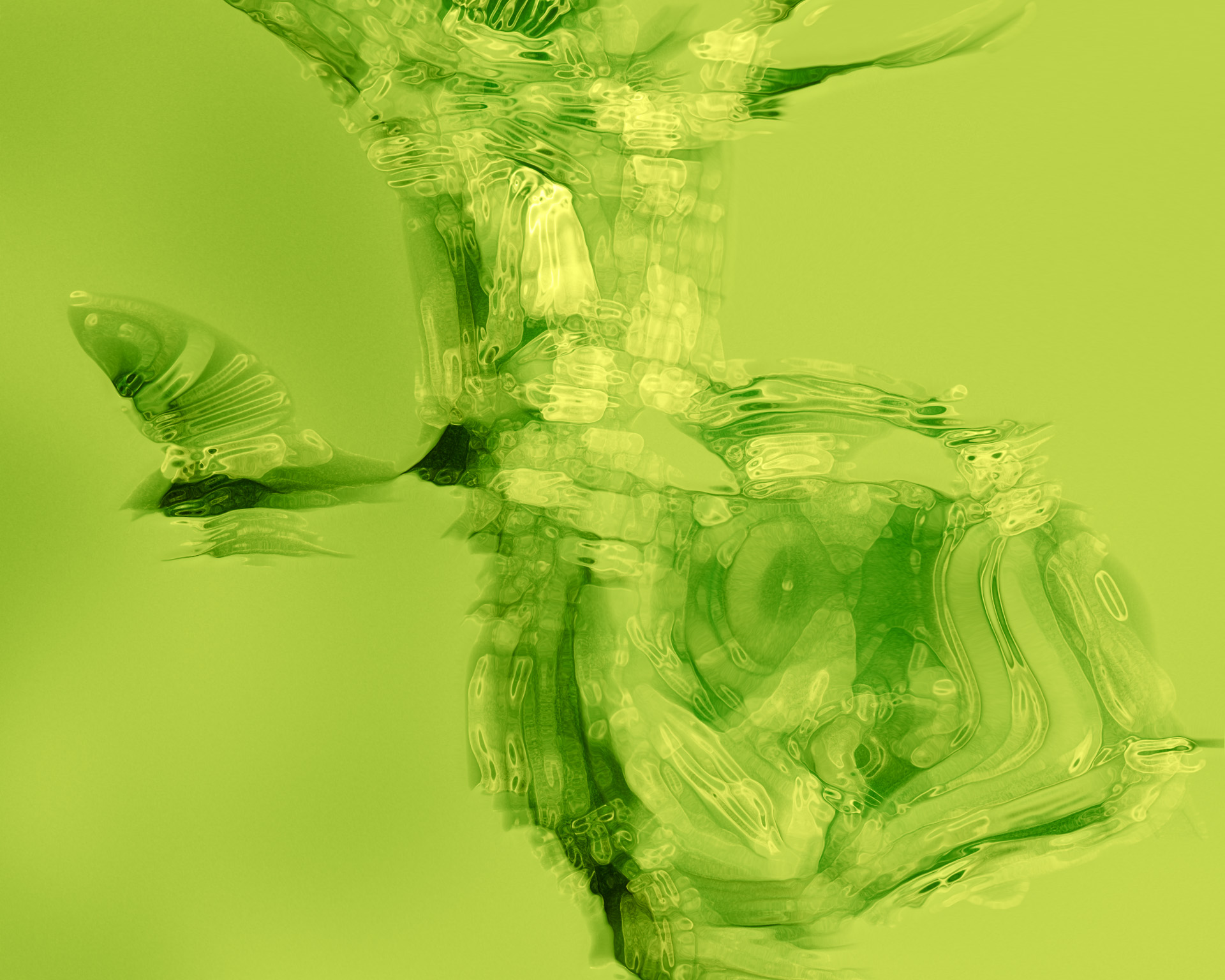
Green Glow is a highly emotive, responsive bright. Sitting between yellow and green, this hue radiates and illuminates, bringing to mind neon and infrared lights. There is a hypnotic quality to this shade, which can bring up a mix of emotions, from uneasiness to enthusiasm. Playing into these emotions fuels a sense of escapism in everyday life.