HARVEY NICHOLS UNVEILS REVAMPED HONG KONG SHOP

Luxury retailer Harvey Nichols has revealed its revamped store in Hong Kong’s Pacific Place with a new concept by boutique design firm Studio Four IV.
The two-story Pacific Place store has been consolidated into a single floor as part of the redesign, and while floor space has been halved, the new concept sees Harvey Nichols expanding its product offering and giving customers access to new experiences and services.
In this tech-savvy market where customers are open to experimentation and new ways of shopping, the new design inextricably links interactive hi-tech with more traditional physical shopping experiences.
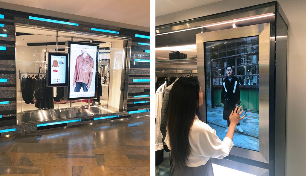
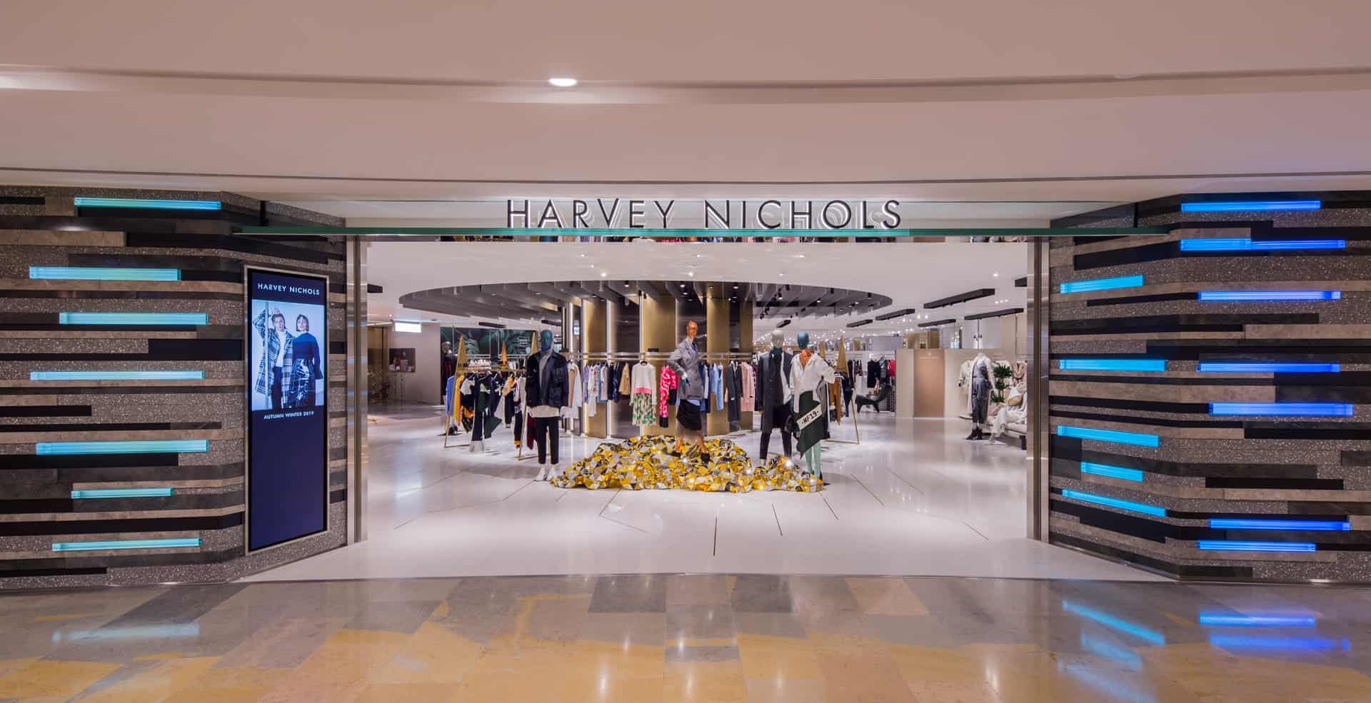
The experience starts before customers even enter the store. Along with the interior, the exterior also has a completely new look. The eye-catching, expansive storefront features a complex design of slivers of stone, tessellated with lit glass rods, whose light gently pulses across the length of the store, hinting at the tech that visitors will experience inside.
Interactive touchscreens in the windows spark interest as customers swipe through the myriad options, scanning QR codes to download product details to ‘build their look’ inspired by the products displayed alongside. While beyond the display, the large windows provide them with further enticement as they look onto the activity in the store.
Inside, the concept explores the premise that the store is ‘bigger than its four walls’. While the physical footprint of the new store now stands at 42,000 square feet, whether shopping for beauty, watches, clothes, shoes or accessories, customers can enjoy the full Harvey Nichols experience through this tech-enabled store.
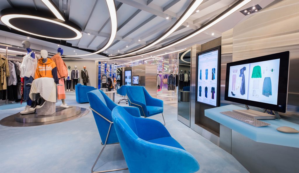
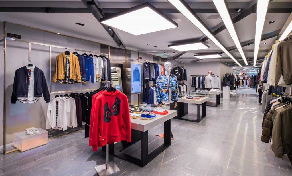
This idea is brought to life in the redesign. Interwoven with technology, the new concept allows customers to shop the store’s merchandise, browsing the shelves and rails, instinctively continuing to explore Harvey Nichols’s endless aisle via the touchscreens that are interspersed throughout their journey, scanning and saving any items of interest. And whilst the screens are not in use, customers are inspired by rich content showcasing catwalk shows, editorial films and curated collections of complementary garments and accessories that supplement the in-store edit.
Like browsing online, the new concept gives customers the freedom to meander around the store. Sightlines have been opened up, improving visibility across the store. Animated framed screens provide signposting, while pathways and lighting gently guide customers, helping them navigate the space with ease. Alongside, intricate design details like the fine metal inlay in the stone flooring, the contrasting linear weave in the bespoke rugs and the design of the lighting framework overhead, emulate computer circuit-boards, providing a further nod to the tech-infused store concept.
While online focuses on stocking major international brands, the physical space is more focused on showcasing newness and emerging labels, giving customers the opportunity to see, touch and feel the product, building appreciation for a new designer – something they are more likely to do through the physical rather than a virtual experience, whilst the greater trust already earned more established brands, means that customers are happy to shop these online.
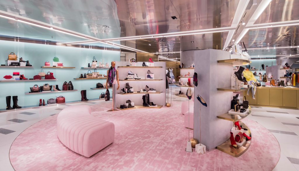
Following Studio Four IV’s concept for the international womenswear floor at the retailer’s London flagship, the store’s designers have created a collection of bespoke fixtures for Harvey Nichols, which gives the retailer ownership of the space and provides a brand canvas upon which each fashion label is presented. Simply signposted in the retailer’s house style, the fixtures also allow the store to flex and react quickly to accommodate the freshest new labels.
The same approach has been adopted for the menswear area of the store, but with the store’s reduction in space, Pacific Place features a smaller edit of menswear. A digital waterfall feature highlights the entrance for menswear, which is presented in ‘e-tunnel’, which as the name suggests, is a more intense digital experience, where greater emphasis is placed on customers browsing collections via the touchscreens.
In the center of the store the ready to wear department wraps round an interactive lounge where customers can browse Harvey Nichols’s website in a more relaxed environment. Building relationships with customers in the luxury market is key and while the store offers customers the option to browse alone or engage with the live chat to connect with a stylist, Harvey Nichols dedicated team of stylists is available for consultations, to help each customer with product recommendations to create a look book based on their personal style, needs, and preferences. Customers can then order products to collect in-store or have them delivered to their home or office.
